
Two Simple Ways to Color Code Your Life for Maximum Productivity
Color coding goes beyond aesthetics; it's a powerful tool for minimizing cognitive load and improving organization and productivity in your personal and professional life.

Disclaimer: The productivity advice I'm about to share is derived from my personal experience, recognizing that there are differing opinions on this subject.
Reading time: 8 minutes
What You Will Learn
What is Visual Management?
Two Fundamental Ways of Color Coding
Five Things to Get Color-Coded Now
My Personal Tips
Introduction
Color coding is beneficial for anyone looking to enhance visual organization and streamline information processing.
Individuals with busy schedules, multiple projects, or complex tasks, who want to take their time back and get some real balance in their life often find it helpful.
It provides a quick and intuitive way to differentiate between various types of events, priorities, or categories.
Color coding can make it easier to grasp and manage your schedule, emails, and tasks at a glance.
Personal Experience
When I initially encountered the concept of color coding, it was during my involvement in the lean transformation project at Collins Aerospace—an aerospace maintenance, repair, and overhaul (MRO) station where I was employed.
The primary objective of the project was to revolutionize the entire business through the adoption of Lean Manufacturing methodology. Color coding played a pivotal role in this transformation, serving to differentiate priority levels, inventory statuses, safety zones, operational status, and other critical aspects.
What is Color Coding?
Color coding is a form of visual management that involves using visual cues, other than shapes and symbols, to convey information quickly and effectively. It is particularly useful for organizing, categorizing, and highlighting different elements, making information more accessible and facilitating better understanding. This approach is widely employed in various contexts, including project management, data analysis, and organizational systems.
The Origin of Visual Management
Visual management traces its origins back to the foundational principles of lean manufacturing, notably rooted in the Toyota Production System (TPS). Toyota, in the mid-20th century, pioneered the TPS, a paradigm that prioritized efficient production processes and the reduction of waste. Central to this system was the integration of visual management, a strategy designed to ensure that information was readily available to all employees, fostering a culture of transparency and collaboration within the workplace.
In the context of Toyota's approach, visual cues played a pivotal role. Techniques such as Kanban boards, color coding, and other visual signals were employed to convey critical information related to production status, inventory levels, and the overall flow of processes.
The success of TPS and its visual management methodologies acted as a catalyst, sparking the widespread adoption of similar practices across diverse industries. These practices transcended the realm of manufacturing, finding applications in healthcare, software development, project management, and beyond.
Why It Works
It enables rapid visual differentiation, allowing individuals to quickly identify and process information. Memory enhancement is another key benefit, as associating colors with specific tasks aids in better retention. The use of vibrant colors can draw attention and emphasize crucial information, fostering increased focus. By reducing cognitive load, color coding facilitates better decision-making and overall productivity.
Additionally, it brings organization and clarity to complex data, making it easier to comprehend. In collaborative settings, color coding acts as a visual language, enhancing communication by conveying information efficiently. In situations requiring quick decisions, color-coded systems enable individuals to process information rapidly and make informed choices without extensive details.
Two Ways of Color Coding
While color coding can be subjective, leveraging the combination of these two simple yet effective methods can significantly reduce cognitive load and enhance productivity.
By Category
Begin by conducting a comprehensive evaluation of the various dimensions of your life. Identify key areas such as work, personal development, health, family, and daily responsibilities. Ensure that you capture all significant aspects or spheres of life that contribute to your overall well-being.
When assigning colors to each category, think about the psychological impact of colors and how they resonate with the specific aspect of your life. Choose colors that evoke the right emotions and feelings. For instance, calming and cool colors like blue may be suitable for areas related to relaxation or routine, while energetic colors like vibrant purple may represent business or side hustles.
Examples:
Light Blue: Habits (workout, chores, meditation)
Teal: Personal (hobbies, self-improvement, self-care)
Pink: Family & Social (gatherings, travel, obligations)
Purple: Business (work, side hustles)
Yellow: Reminder & Tasks (need attention)
Pro Tip: Avoid commonly assigned priority colors like red, yellow, and green to minimize confusion and ensure clarity in your visual communication.
By Priority
Color coding by priority allows you to quickly identify and focus on the most important or time-sensitive activities. This could include high, medium, and low priority levels, indicating the urgency or importance of each task.
Assign colors based on priority levels. For example, you might use red for high-priority tasks, yellow for medium-priority tasks, and green for low-priority tasks. This color gradation provides a visual hierarchy, making it easy to identify and tackle tasks in order of importance.
Examples:
Red: Urgent, critical, or deadlines.
Yellow: Pending, in progress, or approaching deadlines.
Green: Completed, success, or positive elements.
Blue: Low priority, calm, routine, or informational.
Adjust the number of levels based on your specific needs, opting for three to four levels. For a prioritization matrix system, I recommend using the Eisenhower Matrix.
5 Things to Get Color Coded Now
Email Inbox

If you use Gmail, you can assign different color labels/folders to signify various priority levels or meanings; for instance, red could indicate critical, orange could signify attention required, yellow could represent awaiting response, and green could denote read-only.
You may also want to organize messages according to different spheres of life so that, at a glance, you can quickly identify the context and urgency. Also, in the future, you can swiftly find information corresponding to the aspect of life.
Essentially, the inbox is a space where you process messages and convert them into corresponding actions. By labeling messages as 'action needed,' 'pending response,' or 'read later,' you can return later and quickly tackle each task according to its priority.
If you're interested in delving deeper into this organizational method, you may find this article on the Zero Inbox workflow insightful.
Calendars
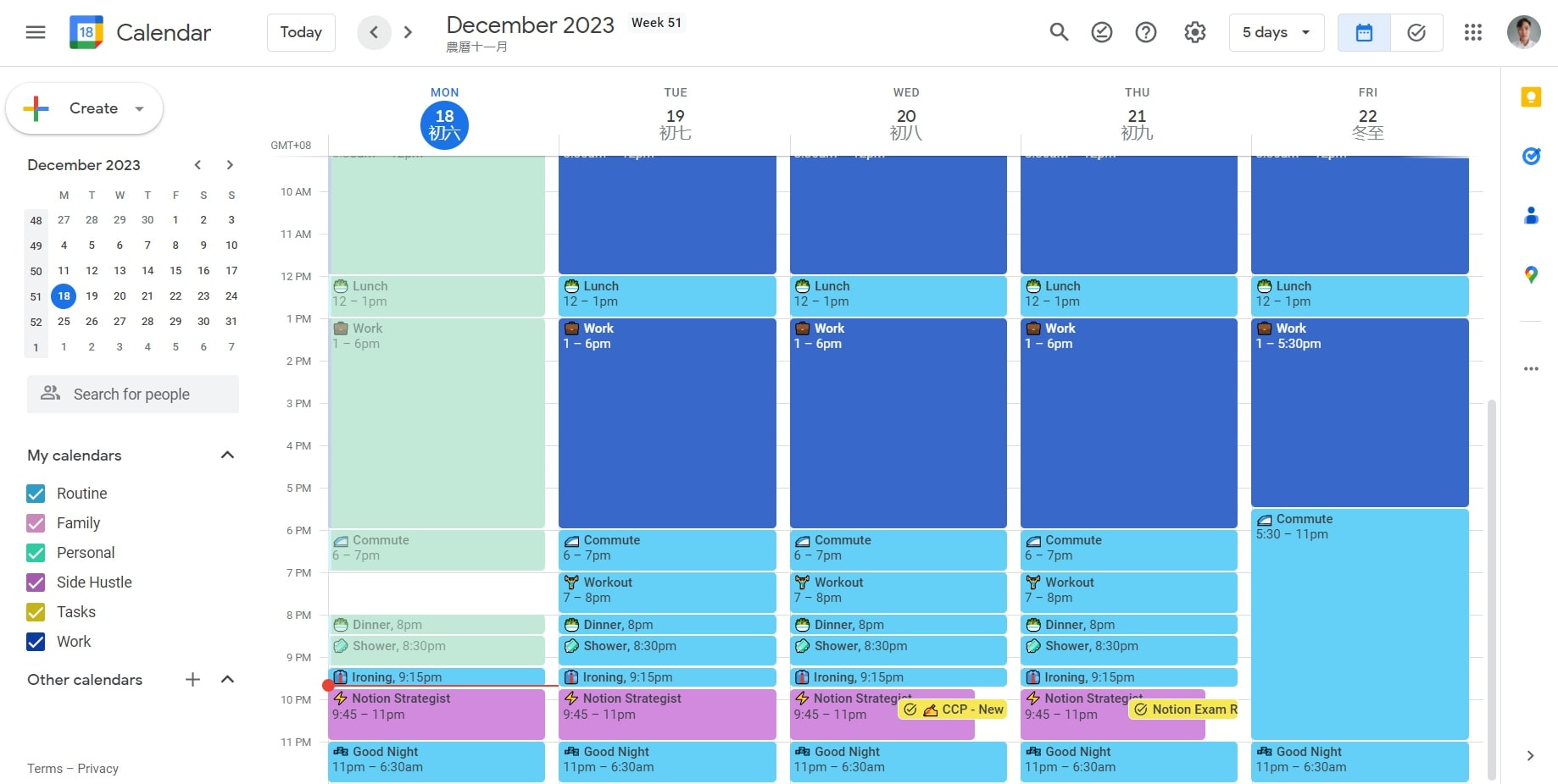
I've adopted a distinctive approach to my digital calendar, utilizing it not only for timeboxing but also as a habit tracker. And, I've got this thing for the 90s vibrant retro color palette – it's just vibes.
I designate blue for grouping routine tasks, including work. This ensures that other colors representing various aspects of my life provide a striking contrast, making it easy to capture my attention.
The key is consistency; I stick to the same colors across all my productivity tools. It might sound like a small thing, but it's like a mental sigh of relief, less thinking involved.
Folders

In my organizational system, most of my information is stored on Google Drive, besides Notion, and the rule remains consistent: assign each folder the same color based on its corresponding sphere of life.

Pro Tip: To make some things stand out (especially if they all fall under the same category/color), I love to use emojis as a secondary system. For instance, in my calendar, I use ⚡️ for my side hustle, Notion Strategist, and 🏋️♀️ for workouts. On Google Drive, I use 🤝 for Agency and 💵 for Finance.
Notes

Adding tags to your notes and knowledge databases allows you to associate them with specific topics, types of content, or contexts. For instance, you could tag a note with "productivity," "time management," or "motivation." You can also use tags like "article," "video," or "course" to indicate the type of content.
While randomly assigning colors can aid in visually distinguishing items and potentially speed up reading, it might not contribute to a meaningful organizational structure or help in understanding the overall context.
To maximize the benefits of color coding, it's essential to assign colors purposefully, aligning them with specific meanings or categories. This intentional approach enhances comprehension and efficiency.
Project/Task Manager

Much like the knowledge database, every task or project is efficiently managed on Notion. This particular project centers on productivity, with a more precise and defined scope. I employ various colors to distinguish the context of the content, and statuses are thoughtfully color-coded to align with their respective meanings.
While it's generally advisable to prioritize consistency, allowing for flexibility and taking a step back can lead to significant improvements, especially in this scenario.
Summary
Color coding enables rapid visual differentiation, memory enhancement, and reduced cognitive load.
Two popular methods: categorizing by different aspects of life and prioritizing tasks by urgency/importance.
Consistent color coding across tools enhances efficiency and reduces cognitive load.
5 things to get color-coded immediately are email inboxes, calendars, folders, notes, and project/task manager.
Coupled with emojis as a secondary system for distinguishing items within the same category.
Conclusion
Take the first step by color coding your email inbox, calendars, folders, notes, and project/task manager. Not only will this bring a sense of order and clarity to your digital spaces, but it will also contribute to improved memory retention, quicker decision-making, and increased overall productivity.
Remember, color coding is more than just a visual enhancement; it's a practical and accessible way to bring balance and efficiency to your daily life. Start experimenting with colors today, and witness the positive impact it can have on your organizational skills and well-being.